Advanced Visual Basic - Project 11
Toolbars - Using an existing Custom
Control
ActiveX - Creating your own Custom Control
There are two parts to this project (Parts A & B). In Part A you will create a simple application that
uses an existing custom control (Toolbar). In Part B, you will enhance the Part
A project by creating and incorporating your own custom control (ActiveX).
Part A
The Icon View Application. Visual
Basic comes with ready made Custom Controls for Windows 95/98 & NT
 |
In Part A of this project, you will experiment with the Toolbar control. Toolbars
are common in virtually all Windows 95/98 & NT applications. A Toolbar displays
a list of Short Cut buttons for the most commonly used commands (which are usually
found on the dropdown menus of the application as well). You will also be using another
Windows 95 Custom Control called an ImageList. An ImageList control lets you store a group of images for use in other controls. An ImageList is
always required when you use a Toolbar control. |
Load Visual Basic and select New Project under the File menu. Make this a Standard
project. View the Form’s properties and make these changes:
- Change the form’s Caption property to I Can Icon
Viewer.
- Change the form’s Name property to frmIcons.
- Change the Project’s Name property to IconViewer.
- Pull down the File menu and choose Save Project. Save the form as: frmIcons.frm. Save the project as IconViewer.vbp.
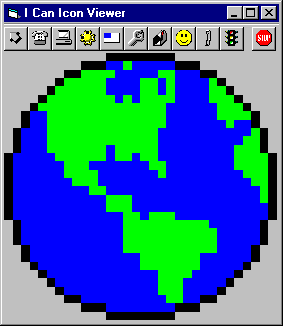
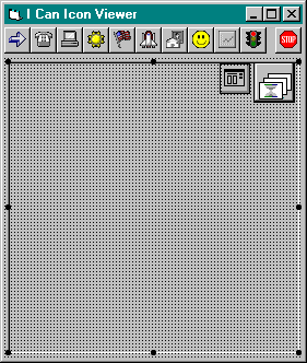
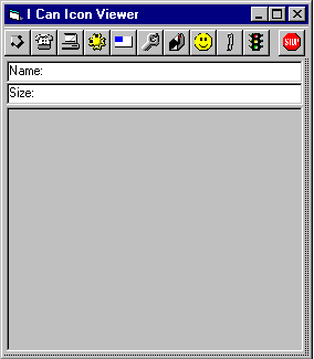
In the above illustration of the finished project, a Toolbar
at the top of the form is used to display the different Icon categories that
may be viewed. They include:
| Arrows |
Elements |
Mail |
| Communications |
Flags |
Miscellaneous |
| Computers |
Industry |
Office |
| Traffic |
An Exit button |
|
All of the Icons used in the Toolbar are provided with
Visual Basic. The icons are not actually part of the Toolbar. They are stored in an
ImageList control.
Before adding a Toolbar, you need to add an ImageList control to your form. Follow these steps:
- To get the toolbox icons for the ImageList and Toolbar
controls to appear in the Control
Toolbox, add the Microsoft Windows Common
Controls 6.0 (or 5.0) component (Right-click on the Toolbox and choose Components, then put
a checkmark in front of Microsoft Windows
Common Controls 6.0 (or 5.0).
- Now double-click on the ImageList control button in the Controls
Toolbox. This control is similar to a CommonDialog control
because the User will never see or directly interact with it.
- View the ImageList control’s properties in the Properties
Window.
- Set the Name property of the ImageList control to iListToolbar.Click on the Custom property and click on
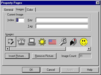
the small ellipses (…) button to produce the ImageList’s Property Pages dialog:
- Click On the 16 x 16 option button. Then click on the Images tab.
If you're doing this project in the CIS Computer lab, ignore
the following note. You'll find the Icon folder in the c:\Shared folder.
However, if you're working online from home, read the following note.
Note: The icon
files you will need for this project are not included with this project because they come
with VB 5 and 6. If you did not install the Graphic files option when you installed
VB 5 or 6, you can go ahead and do that now (Run VB 5 or 6 setup again and choose the Add/Remove items
option). To check if you’ve already got the icon files installed on your computer,
look inside your Visual Basic Graphics folder (usually located at c:\Program Files\DevStudio\vb\Graphics for VB5, or c:\Program
Files\Microsoft Visual Studio\Common\Graphics for VB6).
If you find a Graphics folder check and see if it contains an Icons folder. If the Icons folder is missing,
then you need to install the Graphic
files option of VB (For a minimum installation, you
only need to install the Icon files to do this exercise).
Click on the Images tab of the ImageList Property Pages dialog and add one icon image of your choice (by using the Insert Picture button)
from each of the following folders—in the order shown. Please use the icon I've
specified for image 11:
| 1) icons\arrows |
7) icons\mail |
| 2) icons\comm |
8) icons\misc |
| 3) icons\computer |
9) icons\office |
| 4) icons\elements |
10) icons\traffic |
| 5) icons\flags |
11) icons\traffic\trffc14.ico |
| 6) icons\industry |
|
When you’re finished, the ImageList Properties Pages dialog
should look something like this (with your own images, of course):
Click on the OK button.
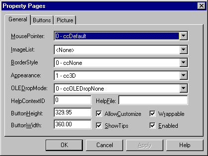
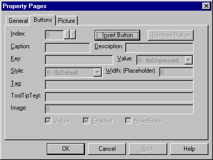
Adding a Toolbar control to the form, follow these steps:
- Double click on the Toolbar control button in the Controls
Toolbox. By default, the Toolbar control
appears at the top of the form. Notice that it has no buttons on it.
- View the Toolbar control’s properties.
- Set the Name property of the Toolbar control to tbIcons.
- Click on the Custom property and click on the small ellipses (…) button to display the Toolbar Property Pages dialog
below:
- Set the ButtonHeight and ButtonWidth properties to 360.
- Drop down the ImageList listbox. Select your iListToolbar ImageList.
- Click on the Buttons tab.
- Click the Insert
Button button. The Index value 1 should appear.
- Type Arrows for the Key value. You’ll need the Key value to determine which button on the Toolbar was clicked.
- For the ToolTip Text type View Arrow Icons. A ToolTip is a descriptive string that pops up by a Toolbar button when you
hold the mouse over the button for a second.
- Type 1 for the Image value and click the Apply button. Notice how the first icon in iListToolbar ImageList appears
in your first toolbar button position.
- Insert 9 more buttons and set their properties as follows:
| Key |
ToolTip Text |
Image |
| Comm |
View Communications Icons |
2 |
| Computer |
View Computer Icons |
3 |
| Elements |
View Elements Icons |
4 |
| Flags |
View Flag Icons |
5 |
| Industry |
View Industry Icons |
6 |
| Mail |
View Mail Icons |
7 |
| Misc |
View Miscellaneous Icons |
8 |
| Office |
View Office Icons |
9 |
| Traffic |
View Traffic Icons |
10 |
- Add an eleventh button and set its Style property to 3 - tbrSeparator.
This Separator needs no Key or Image values.
- Add a twelfth button and set its Key to Exit. Make its ToolTip Text string Exit. And set its Image value to 11.
- Click the OK button to close the Toolbar Control Properties dialog.
Each icon category represented by the buttons of the Toolbar has
its own directory. When the User clicks a button on the Toolbar, an
Open File
dialog box will list the files from the directory which that button represents. Then when
the User selects an icon from the list, it is displayed in an image control (see
the illustration at the beginning of the document).
- Add a Common Dialog control to the form (add the Microsoft Common Dialog Control 5.0 or 6.0 Component to
your Control Toolbox).
- Add an Image control to the form. Set its Name property to imgIcons. Set its Width property to 4100 and its Height property to 4000. Set its Stretch property to True.
- Resize the form to fit tightly around the Image control,
so that it looks like the illustration above.
When the User clicks a button on the Toolbar,
this event procedure is triggered:
Private Sub tbIcons_ButtonClick(ByVal Button As
MSComctlLib.Button)
The ByVal statement means that the argument is passed by value only (which
means it cannot be modified. Note: By default, variables are passed to event and regular procedures ByRef—by
reference (like a pointer in C++)—which means you actually have access to the
memory location where the variable resides, so you can plug new values into it to modify
any previously stored values). ByVal passes just the values stored at the memory location of the
variable, and without knowing the memory location the procedure cannot modify the
values stored there. ByVal is specified by this event procedure, so that you cannot
accidentally change the property values of the Button object at runtime in your code.
The Toolbar button that was clicked on by the User can be determined
by examining the Button.Key property. As an example, if the following code were added to the tbIcons_ButtonClick
event procedure, it would make the Exit button on the Toolbar work (don’t add this code yet):
Select Case Button.Key
Case
Is = "Exit"
End
End Select
Do you remember how you set the Key property of the Exit button to Exit in the Toolbar
Property Pages dialog?
This Key
property is used to determine which button on the Toolbar was pushed (Case Is =
"Exit").
Now add this code to the tbIcons_ButtonClick event
procedure:
Select Case Button.Key
Case
Is = "Exit"
End
Case
Is = "Arrows"
CommonDialog1.DialogTitle = "Arrow Icons"
CommonDialog1.Filter = "Icon Files (*.ico) | *.ico"
‘Be sure to specify the path to your icons folder on the following line
CommonDialog1.InitDir = "c:\shared\icons\arrows"
CommonDialog1.ShowOpen
If CommonDialog1.filename <> "" Then
imgIcons.Picture = _
LoadPicture(CommonDialog1.filename)
CommonDialog1.filename = ""
End If
End Select
The code above enables the Exit and Arrow buttons on the Toolbar.
In the code for the Arrow button above, the CommonDialog control is used to display an Open File dialog which shows only .ICO files in the icons\arrows
folder. If the User selects an icon via the dialog, it is displayed in the imgIcons Image control.
You may test run program now to see if the Arrows actually works.
Be sure to completely read this paragraph before you begin coding.
There are 9 more
buttons on the Toolbar. All of which need code similar to that which you have entered for the Arrow button above (from the
Case Is = "Arrows" statement to the End If statement). You
could just block and copy that code again and again for each button and modify the values
for the DialogTitle and InitDir properties. Or you could create a subroutine that does it all and call
it with a single line of code for each Case statement. Being the good programmer that you are, the choice is obvious.
Put your cursor on the blank line at the bottom of the General Declarations section (on the
line above the first Private Sub statement) and type the following code to create a ShowFiles subroutine:
Private Sub ShowFiles(Title As String, DirName As String)
CommonDialog1.DialogTitle
= Title
CommonDialog1.Filter
= "Icon Files (*.ico) | *.ico"
‘Be
sure to specify the path to your icons folder on the following line
CommonDialog1.InitDir
= "c:\shared\icons\" & DirName
CommonDialog1.ShowOpen
If
CommonDialog1.filename <> "" Then
imgIcons.Picture =
LoadPicture(CommonDialog1.filename)
CommonDialog1.filename = ""
End If
End Sub
To use this neat little subroutine, all you need to do is pass it
the Title, and the Directory Name that you want displayed on the Show
Open dialog.
In the case of the Arrow button, the call to this ShowFiles precedure would look like this:
ShowFiles "Arrow
Icons", "arrows"
Here is the final version of the code for the tbIcons_ButtonClick
event procedure (don’t type the first or last italized lines):
Private Sub tbIcons_ButtonClick(ByVal Button As MSComctlLib.Button)
Select
Case Button.Key
Case Is = "Exit"
End
Case Is = "Arrows"
ShowFiles "Arrow Icons", "arrows"
Case Is = "Comm"
ShowFiles "Communications Icons", "comm"
Case Is = "Computer"
ShowFiles "Computer Icons", "computer"
Case Is = "Elements"
ShowFiles "Elements Icons", "elements"
Case Is = "Flags"
ShowFiles "Flag Icons", "flags"
Case Is = "Industry"
ShowFiles "Industry Icons", "industry"
Case Is = "Mail"
ShowFiles "Mail Icons", "mail"
Case Is = "Misc"
ShowFiles "Miscellaneous Icons", "misc"
Case Is = "Office"
ShowFiles "Office Icons", "office"
Case Is = "Traffic"
ShowFiles "Traffic Icons", "traffic"
End
Select
End Sub
That Finishes Part A. Test the program now and fix any problems. Be sure to save your project
before going on to Part B. Since Toolbars have become as common as dropdown
menus—especially in Windows 95/98 & NT applications—you may want to factor
them into the designs of your future programming efforts.
Part B
Creating a Custom ActiveX Control.
Visual Basic makes it easy to create your own Custom Controls
The term ActiveX gets a little over-used when we start talking about creating custom
controls in Visual Basic. Let us assume that any control you can create in Visual Basic will be an ActiveX control—Always. Prior to
Visual Basic 5.0, creating an ActiveX control required programming in C++. Not only is
that no longer the case, but creating an ActiveX control in Visual Basic is actually
easier (eat your hearts out, C
jockeys).
Constituent (Intrinsic) Controls
There are three methods for creating a custom control in Visual
Basic:
- Enhance a single intrinsic Control (Intrinsic controls are the pre-existing
controls that come with Visual Basic), . i.e. Take a Textbox control and add
additional Properties, Methods, and Event Procedures. It is also possible to modify the behavior of existing Properties, Methods,
and Event Procedures.
- Create a control comprised of multiple intrinsic controls. With the same
options to add and/or modify Properties, Methods, and Event procedures as
in method 1.
- Create a control from scratch. Creating a control from scratch is much
harder than methods 1 or 2.
We are going to use method number 2 to create a custom Image
control built from 1 Image and 2 Label controls, called an ImagePlus control.
When a programmer sets the Picture property of our new ImagePlus control, the bitmap’s file
name and size will automatically be displayed in built-in labels above the image.
The Visual Basic Development team went out of their way to invent
colorful names to describe the objects used to create ActiveX controls. For
example, Constituent
controls are what they decided to call the intrinsic controls that come ready-made
with Visual Basic (Textboxes, Command Buttons, Labels, etc.). When creating ActiveX controls, the new term
for the Object View window (where you add and remove controls from the Form) is
the Visual Designer window. Later, I'll be describing the AmbientProperties object, the Extender object, and the PropertyBag object when we get
around to using them.
The UserControl - a
Container for our custom control
The term Container refers to a control that can contain other controls. The Form is the
main Container control for most Standard Visual Basic applications (Some
other controls are also Container controls: Frames and Pictureboxes
for example). No single object (except for the Form itself) can exist alone. Even
if you wanted to create a simple program that uses only one control (i.e. a single Image),
you would still need to place that Image control on to a Form. The same holds true for creating an ActiveX control. Instead of a Form, you
will use what’s called a UserControl—which looks and behaves a lot like a form at design-time, except it has
no border.
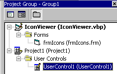
- Make sure your IconViewer project is still open (if it's not, open it now).
- Then select Add Project on the File menu to open the Add Project dialog:
Select the ActiveX
Control icon and click the Open button. Notice the borderless form that
appears in the Visual Designer window. That's your UserControl object—the Form for creating an ActiveX control. Take a look at
the Project Explorer window. It should look like this:
You have just created a Project
Group (A Project that contains multiple separate projects).
If it’s not already selected, make sure the UserControl1 object (inside the User Controls folder) is selected by clicking on
it once. Take a look at its properties in the Properties
Window and make these modifications:
- Change the Name property to ImagePlus.
Do you see this new dimmed icon at the bottom of the Control Toolbox? That’s where your new ActiveX control’s ToolBoxBitmap icon will appear.
Set the ToolBoxBitmap property to ImagePlus.bmp. Use the ellipses button (…) to find this file and select it. In the CIS Computer lab
you’ll find this icon file in the c:\shared folder. Otherwise, use this link to download the ImagePlus.bmp file.
This is what the ToolBoxBitmap icon will look like. However,
it will not be displayed in the Control Toolbox until you close your ActiveX
control’s Visual Designer window. Don’t do that yet.
Click on Project 1 in the Project Explorer window (immediately above the User
Controls folder). Look at its properties in the Properties Window and make this
modification:
- Change the Name property to UserControl.
Now let’s save the Project
Group, and the new UserControl project.
- Pull down the File menu and click on Save
Project Group. Be sure to select the correct location from
the Save In drop-down menu (drive A: if you’re working in the CIS
computer lab). By default, the name of your ActiveX control will be ImagePlus.ctl. Click the Save button to use that name.
- The Save Project dialog will automatically appear next. The default name of the ActiveX
project should be UserControl.vbp. Click the Save button to use that name.
- The last dialog to appear will be Save Project Group As. Change the
default name from Group1.vbg to IconViewer.vbg and click the Save button.
Note: The files for
an ActiveX UserControl project are similar to those of a Standard project.
The code is stored in a file with a .ctl extension (equivalent to the .frm
file of a Standard project). The .ctl file is a plain text file just like a .frm
file. If the ActiveX control contains any binary data (like a picture), it is
stored in a file with the same name as the .ctl file but with a .ctx
extension (equivalent to the .frx file of a Standard project). When you
compile an ActiveX project, a file with an .ocx extension is created
(equivalent to the .exe file of a Standard project, except that .ocx files
are not standalone applications). An .ocx file can contain more than one ActiveX
control.
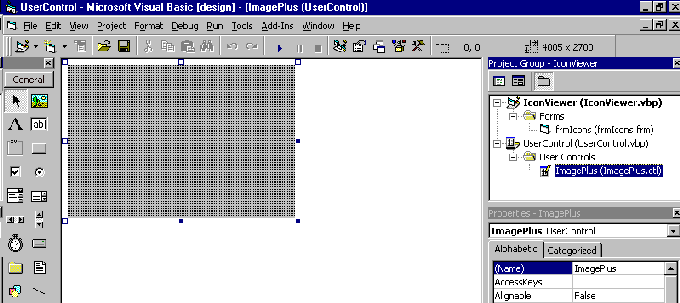
Select the ImagePlus User Control in the Project Explorer window and click on
the Object View button
so that you’re looking at the blank UserControl in the Visual
Designer window (Object View). Your screen
should look like this:
The new UserControl comes with a bunch of Properties, Methods, and Event
Procedures just like a Form. Here is a short list of some of the
properties that are unique to a UserControl and directly effect how the ActiveX control you create will
behave or appear:
- CanGetFocus — A Boolean variable indicating whether or
not the control can receive the focus.
- InvisibleAtRuntime — A Boolean that if True, causes your
control to be invisible when the form it resides on is running. In this case, the programmer
who is using your control will not have access to a Visible property. This would
make your control behave like a CommonDialog or ImageList control, both of
which are only visible at design-time and can only be interacted with via code at
run-time.
- Public — A Boolean that defines whether or not another
application can create an instance of the control.
- ToolBoxBitmap — You’ve already seen how this
property contains the bitmap that will represent your control in the Control Toolbox.
There are many more that I’ll talk about when we use them.
Before we begin to create our custom ActiveX control, let’s
take a look at what a UserControl can do, even before we place any Constituent controls on it.
Close the Visual Designer window of the UserControl by clicking on its Close button in the upper right corner of it:
 |
< Close Button for the Visual Designer window. |
Notice how once the Visual
Designer window of the UserControl is closed,
the Control ToolBox icon for your ActiveX control becomes enabled and looks like this:
View the Form of your original IconViewer project (if it’s not already
showing, select the frmIcons form in the Project
Explorer window and click on the Object View button at the
top of the Project Explorer window).
- Select the imgIcons Image
control on the form and delete it.
Even though we have not yet added any Constituent controls
to our UserControl, go ahead and place 1 ImagePlus control on the form (click once on the new ImagePlus icon in the Control Toolbox, then click and drag a box on the form’s surface to draw the control).
Take a look at the Properties Window to see which properties come with a UserControl by default. You
should see a list of less than 20 properties.
These UserControl properties were not created by you, but are intrinsic to the Container
control—UserControl. These properties are actually provided by an object called the Extender object—The Extender object is the
foundation object that All controls are built from.
The UserControl also comes with 4 (or 5) pre-existing Event
Procedures that the Extender object provides. To see what they are, double-click on the ImagePlus
control that you just drew on the form. This takes you to go to the Code View window. Drop down
the Procedures list
to see the Extender
object-supplied Event Procedures:
These Event Procedures are intrinsic (you may also see Validate
in the list), and every control has them by default.
Take one last look at the Properties Window and at the
limited list of properties that the Extender object provides by default for your ImagePlus user control.
- Click on the Object View button to view the form. Then click on the ImagePlus control you
just drew on the form and press the Delete key once to delete it.
- Select the ImagePlus item in the Project
Explorer window and click on the Object View button at the top
of the Project Explorer window to display the Visual
Designer window of your UserControl
(Remember that the Visual Designer window is equivalent to the Object
View window).
Now take a look at the Properties Window. Where did all the extra properties come from? All these properties
weren’t displayed when you added your ImagePlus control to a form just a minute ago. As the designer of the ActiveX control,
you have access to an extra group of properties that the programmer, who will be using your
control, does not. These properties are provided by the AmbientProperties object. Both the Extender object and AmbientProperties object are
very similar, except that the Properties provided by the AmbientProperties object are
only available to the designer (that’s you) of the ActiveX control.
Here’s a short list of some of the unique properties provided
by the AmbientProperties object to the UserControl designer (that’s you, again):
- Backcolor — For setting the interior color of the
container control itself.
- DisplayName — A string containing the name that the
control should display for itself.
- ShowGrabHandles — A boolean value that specifies if the
container will display grab handles, so the programmer can resize it.
And there are many more (You won't find the DisplayName or
ShowGrabHandles properties in the Properties Windows of
the UserControl because they can only be set at run-time).
Adding Constituent Controls to your ImagePlus UserControl
Like I said before, the easiest way to create a custom ActiveX
control is by building it from Constituent controls (the default controls that come with Visual Basic). So
let’s get down to it. If you’re not already looking a the Visual Designer window with the blank UserControl in it, select the ImagePlus User Control in the Project Explorer window and click on the Object
View button at the top of the Project Explorer window.
- Click once on the ImagePlus UserControl (it looks like a blank Form without a border)
so that its properties are displayed in the Properties
Window.
- Set its Height property to 1695.
- Set its Width property to 1500.
Add the following Constituent Controls to the ImagePlus UserControl.
- Use the Control
Toolbox and place an Image on the ImagePlus UserControl.
Be sure to add an Image, NOT a PictureBox.
- Change the Name property of the Image from Image1 to imgBox.
- Set its BorderStyle property to 1 – Fixed
Single.
- Set its Stretch property to True.
- Add a Label control above the imgBox control.
- Change its Name property from Label1 to lblName.
- Set its BorderStyle property to 1 – Fixed
Single.
- Set its BackColor property to white.
- Set its Caption property to Name:
- Set its Height property to 295.
- Add another Label control above the imgBox control.
- Change its Name property from Label1 to lblSize.
- Set its BorderStyle property to 1 – Fixed Single.
- Set its BackColor property to white.
- Set its Caption property to Size:
- Set its Height property to 295.
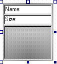
Arrange and resize the imgBox, lblName, and lblSize controls within the ImagePlus UserControl so that it looks like this. Do Not resize the ImagePlus UserControl:
This is the minimum size that you want your custom ActiveX control
to be when a programmer places your ImagePlus control on their form at design time. Of course you want the programmer to
be able to resize the control to their liking, however you’re not going to let them
make it any smaller than this or it wouldn’t be usable. To that end, you must add
some code to the Resize event procedure of the UserControl. The programmer who uses your
control will not have access to this Resize event procedure (unless you expose it to them with a RaiseEvent call, which
I’ll talk about later).
Click on the View Code button on the Project
Explorer window. Before adding any code to the UserControl_Resize event
procedure, create these constants in the General
Declarations Section:
'There are 15 Twips per Pixel
Private Const MIN_HEIGHT = 1695
Private Const MIN_WIDTH = 1500
'30 twips = 2 Pixels (Also used for the TOP Margin)
Private Const LEFT_MARGIN = 30
'60 twips = 4 Pixels (Includes LEFT_MARGIN)
Private Const RIGHT_MARGIN = 60
'90 twips = 6 Pixels (Includes spacing between
controls)
Private Const BOTTOM_MARGIN = 90
Pull down the Object list—the drop-down list on the
top left of the Code View window—and select UserControl. Do you recall how no matter what name you give a Form in a Standard
project, it appears as Form in the Object List? The same holds true for a UserControl,
which we’ve actually named ImagePlus, however it shows up as UserControl in the Object List.
Once you’ve selected the UserControl object, pull down the Procedure list—the
drop-down list on the top right of the Code
View window—and choose the Resize event procedure. Add
this code to the UserControl_Resize event procedure:
If UserControl.Height < MIN_HEIGHT Then 'No
shorter than MIN_HEIGHT
UserControl.Height
= MIN_HEIGHT
End If
If UserControl.Width < MIN_WIDTH Then 'No narrower than MIN_WIDTH
UserControl.Width
= MIN_WIDTH
End If
lblName.Left = LEFT_MARGIN
lblName.Top = LEFT_MARGIN
lblName.Width = UserControl.Width - RIGHT_MARGIN
lblSize.Left = LEFT_MARGIN
lblSize.Top = lblName.Height + LEFT_MARGIN
lblSize.Width = UserControl.Width - RIGHT_MARGIN
imgBox.Left = LEFT_MARGIN
imgBox.Top = lblName.Height + lblSize.Height + RIGHT_MARGIN
imgBox.Width = UserControl.Width - RIGHT_MARGIN
imgBox.Height = UserControl.Height - lblName.Height - _
lblSize.Height
- BOTTOM_MARGIN
After adding this code to the UserControl_Resize event procedure,
click the Save button
on the VB toolbar—be sure to save your project frequently from this point forward.
Attention: To test your ActiveX control from here
on, you MUST Close the UserControl’s Visual Designer and Code View windows before activating the IconViewer project.
Otherwise you may get a catastrophic error, and an untimely visit from Doctor Watson—Don’t
say I didn’t warn you!. This is the downside of working with a UserControl as
part of a Project Group. However, it is worth the risk to be able to test your ActiveX UserControl
as it's created.
In order to test your ActiveX control, you must Close the UserControl’s Visual Designer and Code View windows. Do this now by clicking the Close buttons of both the Code View
window and Visual Designer windows.
|
< Close Button |
After closing the UserControl’s Visual Designer and Code View windows, select the frmIcons form in the Project
Explorer window and click the Object View button to view it. Click on the icon of your ImagePlus control in the Control Toolbox and draw one ImagePlus control on the Form. Use the Grab Handles to resize the ImagePlus control.
Notice how when you make it too small and let go, it snaps back to the minimum size you
specified in the UserControl_Resize event procedure. This means that the Resize event procedure of the UserControl is
actually being processed NOW—Before the program is even running! This is actually true of all
controls, including the intrinsic ones. For example, when you place a Command Button on a form and then resize it, the Resize event procedure of its Extender object is executed. But a quick examination of a Command Button’s event procedures reveals that there is no Resize event procedure.
Remember that the Extender and AmbientProperties objects come with many Event Procedures, Properties, and Methods
that you can’t see because the designer of the control didn’t make them
available—What good would a Resize event procedure do for a button anyway? You’re going to follow the same
principles for your ImagePlus control: Allow the programmer access to only those Event Procedures, Properties,
and Methods that you see fit to give them. However, you have no control over the
reduced set of Event Procedures, Properties, and Methods that the Extender object gives your ActiveX
control.
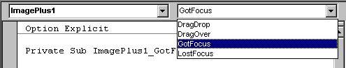
If you click on the Code
View button, and take a look at the list of Event Procedures that
are available for your ImagePlus control, you’ll find it still only contains, DragDrop, DragOver,
GotFocus, LostFocus (and Validate). Well fix that soon.
Resize the ImagePlus control so that is fills the form like this:
Adding Event Procedures to the ImagePlus ActiveX control
Save your project now. Go back to the Visual Designer window (Code View) of your ImagePlus control by
selecting the ImagePlus user control in the Project Explorer window. and
clicking on the Code View button at the top of the Project
Explorer window.
- Add this declaration at the bottom of the General Declarations Section (on the line above the first Private Sub line):
Public Event Click( )
- Add the following line of code to the imgBox_Click event procedure:
RaiseEvent Click
Gee, that was hard! You’ve just added a Click event
procedure to your ImagePlus ActiveX control. You performed this "difficult" task by Raising an Event with the RaiseEvent statement.
RaiseEvent
actually generates the Click event which you declared with the single Public Event Click() declaration you
added to the General Declarations
Section above.
- Save the project. Go to the Code View of your frmIcons Form of the IconViewer project, and take a
look at the list of Event Procedures for your ImagePlus control. You should see Click as a new addition.
- Now you’re going to create a simple custom Event Procedure. Go back to the Code View of your ImagePlus control and add this line of code directly below the Public Event Click() line at the bottom of the General
Declarations Section (above the first Private
Sub line):
Public Event RightButtonClick( )
- Recall that RightButtonClick is not the name of an Event
Procedure that you have ever seen before. This is a
custom event procedure, and I’ve just made up the name RightButtonClick. To get it working, add this code to the imgBox_MouseUp event procedure:
If (Button And vbRightButton) Then
RaiseEvent RightButtonClick
End If
Gee, that was hard, too! You’ve just added a custom RightButtonClick event
procedure to your ImagePlus ActiveX control. The statement If (Button And vbRightButton) Then, performs a bitwise comparison of the Button property
(passed to the MouseUp event procedure by the operating system), with the visual basic constant vbRightButton. If the result of this comparison is True it’s because the user
pressed the right mouse button. I’ve decide to use the MouseUp event procedure here because
you can’t tell which mouse button was used in the Click event
procedure—it isn’t passed a Button parameter by the operating system.
- Save the project. Go to the Code
View of your frmIcons Form of the IconViewer project, and take a
look at the list of Event Procedures for your ImagePlus control. You should now see RightButtonClick as another new addition.
As you can see, adding Event Procedures to an ActiveX
user control is relatively easy. By using pre-existing Event Procedures and
adjusting how they behave, the possibilities are limitless.
Adding Properties
to the ImagePlus ActiveX control
Can adding Properties to your custom ActiveX user control be as easy as adding Event Procedures? Almost.
Let’s start by adding 4 new properties:
NameForeColor, NameBackColor, SizeForeColor, and SizeBackColor
- You’ll start with the NameForeColor property. Insert the
following code at the bottom of the General
Declarations Section (above the first Private
Sub line):
Public Property Get NameForeColor() As OLE_COLOR
NameForeColor =
lblName.ForeColor
End Property
Public Property Let NameForeColor(ByVal NewForeColor As OLE_COLOR)
lblName.ForeColor =
NewForeColor
PropertyChanged
"NameForeColor"
End Property
While several Properties are exposed to the programmer using your ActiveX control by the Extender object by default, it
is also possible to expose other Properties to the programmer as needed. With the code above, you’ve created a new Property called
NameForeColor
that the programmer who’s using your ImagePlus control can use to set the ForeColor of the label that will display the Name of the image being
viewed. OLE_COLOR is
an enumerated data type designed for properties that return colors. It automatically
generates a color selection dialog that the programmer can select a color from when they
change the NameForeColor property in the Properties
Window.
The Public Property Get NameForeColor procedure above lets
the programmer copy the value from the NameForeColor property by using code like this in their program:
iNameColor = ImagePlus1.NameForeColor
This line of code copies the value of the NameForeColor property (which you, as the UserControl designer, know is actually
the value of the ForeColor property of lblName label control) to a variable (iNameColor).
The Public Property Let NameForeColor procedure above lets
the programmer dynamically (at run-time) set the value of the NameForeColor property
by adding code like this to their program:
ImagePlus1.NameForeColor = vbBlue
Which will assign the color value for Blue to the NameForeColor property
(actually the ForeColor property of lblName label control). The PropertyChanged method at
the end of the Public Property Let NameForeColor procedure notifies the container (usually a Form)
that the value of the property has changed so it’s value can be updated immediately
(important when the programmer changes the value of the NameForeColor property
in the Property Window at design time). The PropertyChanged call would be omitted for a Property that can only be changed
via code a run-time.
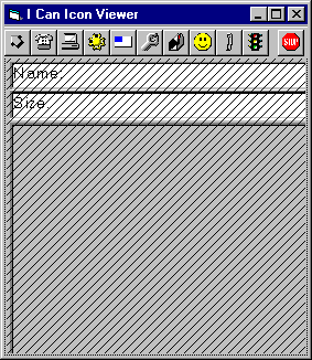
- Save the project. To see if the new NameForeColor Property works, go back to
the Object View
of the frmIcons Form
of the IconViewer project. If the ImagePlus control looks like the illustration below (cross-hatched with black lines),
go back to the Visual Designer window for your ImagePlus UserControl then close it and the UserControl's Code View
window. Note: You can’t test your ActiveX control while its Visual Designer or Code View windows are open.
- Click on the ImagePlus control to view it’s properties. Do you see a NameForeColor
property in the list? Try using it. Change the NameForeColor property to Red. Does the text in the Name: label
change? It should.
- After changing the NameForeColor to Red, run the IconViewer project. Does the Name: stay red? Nope. Why not?
As it is now, if the programmer sets the NameForeColor at design
time using the Properties
Window, the value will be updated on
the form, as it should be, by the PropertyChanged call you added to the Public Property Let NameForeColor
proecedure, but if they close the Form window, or if they test run the project, the
changes they made to the NewForeColor property are lost. It turns out that the designer of a control must
explicitly tell the container control (Form) that the current value of a property
should be maintained (persisted). This is referred to as Property Persistence.
Properties values set in the Properties Window usually
should persist between design-time and run-time. Design-time property
settings are saved to the project’s Form file. The programmer who is using
your ImagePlus control will expect the design-time settings for the Form and all the objects it
contains to become the initial run-time values of those objects. To make that happen,
you—the ActiveX control designer—must use the PropertyBag object.
The PropertyBag
Object - Persisting Properties
Visual Basic does not save design-time properties automatically when
the form is closed or when Visual Basic switches from design-time to run-time. Persistent
properties are saved and retrieved using an object called the PropertyBag. The PropertyBag is like
the Extender
and AmbientProperties objects because it is part of a UserControl by default. The PropertyBag object has only two methods:
- WriteProperty — Writes the value of a property to the PropertyBag
object (available through the UserControl_WriteProperty event procedure).
- ReadProperty — Reads a property from the PropertyBag
and returns the value for the property (available through the UserControl_ReadProperty
event procedure).
You also need to use the UserControl_InitProperties event procedure to initialize the values of the Properties that you
create or expose in your ActiveX controls.
- Go to the Code View of your ImagePlus user control and add this line of code to the UserControl_InitProperties event
procedure:
lblName.ForeColor = vbRed
This makes Red the default ForeColor value of the text in the
Name label (lblName) whenever a programmer adds a new ImagePlus control to
a Form.
- Add this line of code to the UserControl_WriteProperties event
procedure:
Call PropBag.WriteProperty("NameForeColor", lblName.ForeColor, vbRed)
This call writes the value of the Name label’s ForeColor
property to the PropertyBag, so that it can be read later by the ReadProperties event. The
last vbRed parameter is the default value that’s used if ForeColor contains
a 0 value.
- Add this line of code to the UserControl_ReadProperties event
procedure:
lblName.ForeColor = PropBag.ReadProperty("NameForeColor", vbRed)
This call reads the stored value of the Name
label’s ForeColor property from the PropertyBag. The last vbRed parameter is the default value that is
returned if no value had previously been stored in the PropertyBag object.
Save the project, and test your ImagePlus control in the IconViewer program. Try
changing the value of the ImagePlus control’s NameForeColor property in the Property
Window, and run the project to see if it retains
it. If you entered the above code correctly, it should work.
Adding 3 new Properties to the ImagePlus ActiveX control
Let’s finish adding properties for NameBackColor, SizeForeColor, and SizeBackColor to your
ImagePlus
control.
- You’ll begin by creating the Get and Let Public Property procedures
for the three new properties. Go back to the Code View of your ImagePlus user control and Insert the
following code, at the bottom of the General
Declarations Section (like before). This code is
for the custom NameBackColor property:
Public Property Get NameBackColor() As OLE_COLOR
NameBackColor =
lblName.BackColor
End Property
Public Property Let NameBackColor(ByVal NewBackColor As OLE_COLOR)
lblName.BackColor =
NewBackColor
PropertyChanged
"NameBackColor"
End Property
- Add this code for the custom SizeForeColor property:
Public Property Get SizeForeColor() As OLE_COLOR
SizeForeColor =
lblSize.ForeColor
End Property
Public Property Let SizeForeColor(ByVal NewForeColor As OLE_COLOR)
lblSize.ForeColor =
NewForeColor
PropertyChanged
"SizeForeColor"
End Property
- Add this code for the custom SizeBackColor property:
Public Property Get SizeBackColor() As OLE_COLOR
SizeBackColor =
lblSize.BackColor
End Property
Public Property Let SizeBackColor(ByVal NewBackColor As OLE_COLOR)
lblSize.BackColor =
NewBackColor
PropertyChanged
"SizeBackColor"
End Property
Remember that the PropertyChanged call at the end of each of the Property
Let procedures are only necessary if you want the programmer
to be able to set these properties at design-time via the Properties Window. Note: When you want
to create a Property
that can only be modified at run-time, the Property Let procedure would look the same
as these, without the PropertyChanged lines of code. Also, a run-time-only modifiable property should not have a Property Get procedure,
so that it is prevented from appearing in the
Property Window at design-time.
- To store any changes to the values of these properties that the
programmer makes at design-time, you need to add the code to use the PropertyBag object
like you did for the NameForeColor property (Note: A control that is designed so that its properties can only be changed at
run-time, will not need the following code). Add the following code to the UserControl_InitProperties event procedure:
lblName.BackColor = vbWhite
lblSize.ForeColor = vbRed
lblSize.BackColor = vbWhite
- Add this code to the UserControl_WriteProperties
event procedure:
Call PropBag.WriteProperty("NameBackColor", lblName.BackColor, vbWhite)
Call PropBag.WriteProperty("SizeForeColor", lblSize.ForeColor, vbRed)
Call PropBag.WriteProperty("SizeBackColor", lblSize.BackColor, vbWhite)
- Add this code to the UserControl_ReadProperties event procedure:
lblName.BackColor = PropBag.ReadProperty("NameBackColor", vbWhite)
lblSize.ForeColor = PropBag.ReadProperty("SizeForeColor", vbRed)
lblSize.BackColor = PropBag.ReadProperty("SizeBackColor", vbWhite)
Now save the project.
Adding a changeable at run-time only Property to the ImagePlus ActiveX control
The four properties that you just added above can be modified at
design-time; the programmer can set their values from the Properties Window, and
whatever values they assign to the properties will be the default values when the program
is run. Now you’re going to add a Picture Property to your ImagePlus ActiveX control. But the Picture property will be
changeable only at run-time—A property designed to be modified only at run-time
cannot appear in the Property Window
at design-time.
- Insert the following Property
Let procedure code at the bottom of the General Declarations Section:
Public Property Let Picture (ByVal NewPicture As String)
Dim i As Integer, iPos As Integer
imgBox.Picture = LoadPicture(NewPicture)
lblSize.Caption = "Size: " &
FileLen(NewPicture) & " bytes"
‘Find the last backslash in the NewPicture string to extract just the
filename part
For i = 1 To Len(NewPicture)
If
Mid(NewPicture, i, 1) = "\" Then
iPos
= i
End If
Next I
LblName.Caption = "Name: " &
Right(NewPicture, _
Len(NewPicture)
– iPos)
End Property
That’s it. Save the project now. You don’t need a Get property procedure for a
property that’s changeable only at run-time. Note: Without
both Get and
Let property procedures, a property you
create will not show up in the Property
Window at design-time.
Adding custom descriptions to Properties and Event
Procedures you create
You must have noticed before that when you click on a Property in
the Properties Window, a useful description
of what the Property does is displayed in a small Description
window that is attached to the bottom the Properties Window (Try it now: Click on a
property name in the Properties Window to see a description of that property below the
window).
Adding descriptions to Properties or Event Procedures that you
create is easy. While viewing the Code Window of your UserControl, select the Procedure Attributes item from the Tools
drop-down menu. Choose the Property or Event Procedure that needs a description from
the Name combo box and type a description
for it in the Description text box.
Testing your ImagePlus control
To test your new ImagePlus ActiveX control, go back to the Code View of the frmIcons Form of the IconViewer
project. Make this modification to a single line of code from your ShowFile procedure (the arrowed
bold line):
Private Sub ShowFiles(Title As String, DirName As String)
CommonDialog1.DialogTitle = Title
CommonDialog1.Filter = "Icon Files (*.ico) | *.ico"
CommonDialog1.InitDir = "c:\shared\icons\" & DirName
CommonDialog1.ShowOpen
If CommonDialog1.filename <> "" Then
à
ImagePlus1.Picture = CommonDialog1.filename
CommonDialog1.filename
= ""
End If
End Sub
Notice how you’ve removed the LoadPicture statement from
your original version of this line. That’s because the LoadPicture call was
integrated into the Picture property by the ActiveX control designer
(that’s you).
- Save the project now. Take the IconViewer program for a
test spin and see how it works.
Compiling your new ImagePlus control to create an OCX (object library) file
It’s easy to create a compiled version of your ImagePlus control (an .ocx file) that you can give
your friends, so they can use it in their programs:
- Select the UserControl project in the Project
Explorer window.
- Pull down the File menu and click on Make
UserControl.ocx.
- Use the Save In
drop-down listbox to select an appropriate location for this
file. Normally, .ocx files are stored in the System (windows 95/98) or System32 (windows NT) folders. If you’re doing this exercise in the CIS computer lab, choose drive A:
- Once the UserControl is compiled, choose New Project on the File drop-down menu. Make it a Standard project.
- Notice that the icon for you ImagePlus control is missing from the
Control Toolbox. To add it, tight-click on the Control
Toolbox and select Components from the context menu.
- Make sure the Controls tab is selected and click on the Browse… button.
- Find your UserControl.ocx file and double-click on it.
- You should see a new item named UserControl appear at the
bottom of the control list with a check mark in front of it. Click the OK button.
- If you followed all these steps correctly, the custom icon for your ImagePlus control should
now appear at the bottom of the Control
Toolbox. Now you can use the ImagePlus control
like any other intrinsic control.
A final word about ActiveX controls
As you might imagine, we’ve just scratched the surface of custom
ActiveX UserControl creation—but it’s a pretty deep scratch. Some of the
techniques you used to create the ImagePlus control in this project are worth reiterating:
- By using a Group Project you were able to construct and test your UserControl as you built it.
- You learned that there are only a limited number of Properties,
Methods, and Event procedures that a programmer using your ActiveX
control can see by default. You learned that these were provided by the Extender and AmbientProperty objects
which are the foundation objects of all Visual Basic controls.
- You learned how easy it is to give programmers, who will
ultimately use your ActiveX control, access to new Properties and Methods—pre-existing
and created by you—by Exposing them.
- You discovered that you can use a RaiseEvent call to give them access to Event Procedures.
- You learned that Property
Persistence was something that you—the control
designer—had to implement with the ReadProperty and WriteProperty methods of the PropertyBag object.
- You learned how much fun it is to create your own custom ActiveX
controls!

